Combobox
The Combobox component is used to capture query input via a text field. It can also provide suggestions, typeahead and instant search modes.
Import
Usage
Editable Example
Suggestions
Variants
The compobox component comes in 2 variants: outline and unstyled. Pass the variant prop and set it to one of these values.
Editable Example
Suggestions
Suggestions
Sizes
Use the size prop to set the size of the combobox. The default is md.
Editable Example
Suggestions
Suggestions
Suggestions
Suggestions
Suggestions
Suggestions mode
Set the mode prop to suggestions to render autocomplete suggstions.
Editable Example
Current query:
Current value:
Results mode
Editable Example
Results
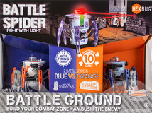
HEXBUG - Battle Spider Battle Ground - Multi
Experience a revolutionary fight with this Hexbug Battle Spider Battle Ground. Two remote control spiders fight to the end with infrared sensors that have 1.5-meter fire ranges. Each spider has a 360-degree rotating head and LED eyes that let you steer it toward its opponent. This Hexbug Battle Spider Battle Ground comes with 15 walls for a fun, challenging match.
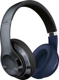
Beats by Dr. Dre - Beats Studio Wireless Over-Ear Headphones - Unity Edition Red White Blue
Beats Studio Wireless Unity Edition combines iconic Beats sound and design with country pride elements. Each headphone incorporates country-inspired graphic elements with a unifying black band for a signature Beats look.

Epson - 664 Ink Bottle - Cyan
Print documents, flyers and brochures in vibrant color with this Epson 664 high-yield ink bottle, which works with select Epson EcoTank printers, including ET-2500, ET-2550, ET-4500 and ET-4550.
Typeahead mode
Set the mode prop to typeahead to render a typeahead suggestion.
Editable Example
Suggestions
Loading
Editable Example
Suggestions
Speech recognition
Editable Example
Suggestions
Props
Combobox component props inherits the input element props with some additional for speech recognition and loading state
| Name | Type | Default | Description |
|---|---|---|---|
mode | 'standard' | 'typeahead' | 'suggestions' | 'results' | 'standard' | The mode of the combobox. 'standard' will operate as a normal text input. 'typeahead' will provide an inline completion suggestion. 'suggestions' will provide an autocomplete menu with options to select. 'results' will perform a full search using the provided term and render full results. |
loading | boolean | false | Show the spinner icon. |
enableVoice | boolean | false | Whether to enable speech recognition (Compatibility table.) |
autoFocus | boolean | false | Automatically get focus when the page loads. |
captureVoiceInput | boolean | true | Whether to set the combobox value to the voice input, if enabled. |
onChange | (value: string) => void | The callback when the input value changes. Note: The event is not passed as the argument. | |
onSelect | (value: T) => void | The callback when an item is selected. | |
onVoiceInput | (value: string) => void | The callback when a voice transcript is output. | |
items | string[] | An array of strings to use for autocomplete suggestions. | |
completion | string | A string to use for a typeahead value. | |
itemToString | (item:T) => string | A callback to convert item (object) to string. | |
itemToUrl | (item:T) => string | A callback to get/compute url from item object for results mode. | |
renderItem | (params) => React.ReactNode | A render prop function for customizing result item view. | |
size | 'sm' | 'md' | 'lg' | 'xl' | '2xl' | md | The size of the combobox. |
variant | 'outline' | 'unstyled' | outline | The appearance of the combobox. |
showDropdownTips | boolean | false | Whether to show tips in the dropdown on how to navigate the options. |
showPoweredBy | boolean | true | Whether to show the "Powered by Search.io" in the dropdown. |
inputElement | { current: HTMLInputElement } | Input element to render the combobox in attach mode. | |
portalContainer | document.body | The portal container which will be the container for the combobox's dropdown. |